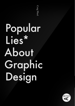
Notes on Publishing
So the book has been officially available for three weeks today and, as I write this, is sat at #1 in Advertising/Graphic Design on Amazon.co.uk and .com, which is pretty cool to be… Continue reading
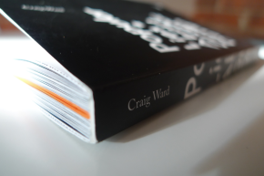
So the book has been officially available for three weeks today and, as I write this, is sat at #1 in Advertising/Graphic Design on Amazon.co.uk and .com, which is pretty cool to be… Continue reading
A little late to post this but things have been pretty crazy of late with the book coming out. I wanted to post some behind the scenes work that went into the ITV… Continue reading
“This is not a book full of facts. Nor is it a book full of advice. It’s a book full of opinions, and confusion between those three is how a lot of these… Continue reading
While I’m loathed to admit, next year will be my tenth year in the industry – despite feeling like I’m only just getting started having committed to the studio for the first time… Continue reading
I was having a slow day waiting for some feedback and thought it might be nice to make some iPhone backgrounds using my work. Help yourself to the below; each has a lock… Continue reading
One of my favourite things is receiving emails from people either keen to share ‘their’ work that I have ‘inspired’ or who have spotted work they believe has been ‘inspired’ by me. Sometimes… Continue reading